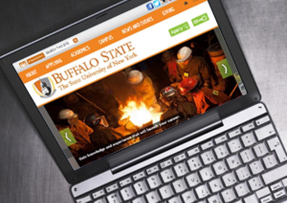
Get ready for a fresh new look and feel for SUNY Buffalo State online. Buffalo State’s website has been completely overhauled to provide more interactivity, a modern layout, and improved user experience.
Preview the new site at suny.buffalostate.edu before it goes live.
"The new Buffalo State website offers a clean, contemporary look and delivers an easy-to-navigate, intuitive web experience to our many audiences," said Interim President Howard Cohen. "Buffalo State provides diverse, academically challenging, individualized learning experiences. Our website now fully demonstrates this rich variety of opportunities. The launch of this new site is a significant accomplishment."
Receiving more than one million visitors per year, the Buffalo State website is the institution’s most highly visible resource. The last web redesign was launched in 2009. Since then, the web has changed dramatically, including widespread adoption of mobile technology, social media, and video.
"Buffalo State's web presence is the most effective and prominent communication channel for the campus," said Tim Walsh, associate vice president for college relations. “The site is a key tool for prospective and current students, alumni, parents, faculty and staff, donors, and the community for accessing all aspects of the college.”
While the site’s style has changed, its overall structure has not. The new site integrates modern user-expectations with a logical, intuitive flow of information.
The site remains the go-to resource for everything Buffalo State—from student profiles to program descriptions, applications, and college news. Essential information can now be easily found on several top-level pages, allowing users to avoid digging through multiple layers to find what they need.
In addition, the new site incorporates many new custom features:
- Responsive design—Optimized for mobile devices and compatible with all web browsers
- Main navigation, search, social media icons that follow the user or can be pinned at top of browser
- Google Translate on every page
- Audience navigation for future and current students, faculty and staff, and parents on homepage
- Direct social media interaction on homepage
- Slideshows, buttons, and icons that are “touch-friendly” for touch-screen devices
-
Document and link out icons that let users visually know what they are clicking on
The College Relations Office, responsible for site design and development, works in active partnership with Computing and Technology Services on all campus web initiatives. Both areas welcome feedback about the new site. Please feel free to leave your comment below, or send an email to webadmin@buffalostate.edu.
